
Part II: Statistical Process Control — Getting Down to Basics

By Jodi Kay, Quality Engineer, SPSS Inc.
Table of Contents
Factors to Consider when Implementing SPC
Working with Control Charts
• Variable Control Charts
Interpreting Control Charts
• Control Limits vs. Specification Limits
Attribute Control Charts
Conclusion
In Part I of this primer on SPC, the author introduced the basic concepts of statistical process control, including how it relates to quality, advantages, and basic statistical concepts. Part II continues with an in-depth look at implementing SPC and discusses the use and interpretation of control charts, control and specification limits, quality charts for variable and attribute data, and process statistics.
Factors to Consider when Implementing SPC
Another important factor is sample size. In order to assume the sample is normally distributed, it's beneficial, when possible, to obtain a subgroup size greater than one. The larger the subgroup size, the closer the sample will resemble a normal distribution. However, there's a trade-off between the costs incurred (i.e., sampling costs or analytical costs) and the benefits received from inspecting a larger subgroup size. A quality engineer or analyst should determine a rational subgroup size. In some cases, it's not feasible to have a subgroup size greater than one. For example, in a chemical process, a sample may be taken from a large batch. Since the sample is typically homogeneous, the only variation that would be detected is sampling and analytical variation, not process variation. Therefore, a subgroup larger than one wouldn't be applicable. Another example would be if the inspection cost is significant, such as destructive testing.
Sampling frequency — whether it's once per hour, once per shift, or something else — is another criterion to consider. A quality engineer or analyst should determine what frequency would be most practical to detect changes in a process without incurring significant inspection costs or disrupting the process. Careful consideration must be given when determining optimal sampling sizes and frequency in order to decrease the probability of rejecting a good part (an alpha error) and accepting a bad part (a beta error).
Working with Control Charts
Both types of characteristics are useful because, when plotted on a control chart, they can help differentiate between random variation in the quality characteristic and variation with an assignable cause. A control chart plots a quality characteristic measured or computed from a subgroup (vertical axis) versus the time at which the subgroup is sampled (horizontal axis). All control charts display the process lines (upper control limits and lower control limits) representing the variation inherent in the quality characteristic and the center line, indicating the average value of the quality characteristic. These lines are calculated either from the current data or preset based on historical data.
• Variable Control Charts
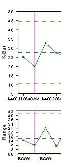
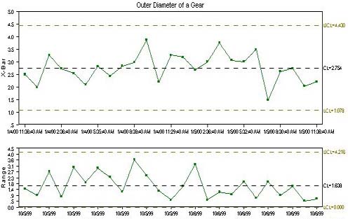
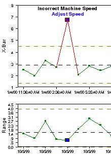
X-bar and Range Chart
Let's say, for example, that we're measuring the outer diameter of a gear in centimeters. The subgroup size equals three and sample frequency is hourly. If the values for the subgroup are 2.5, 3.2, and 1.8, the average would be the sum of these numbers divided by the subgroup size of 3 — or 2.5. Hence, the first point on our X-bar chart would be 2.5. The X-bar chart indicates where the process is targeted or the location of the data. The range chart displays the amount of dispersion or variation in a process. The point plotted in the range chart is the difference between the highest value in the subgroup (3.2) and the lowest value in the subgroup (1.8) or 1.4.
An hour later, we might measure three more parts. If the values of the parts in the subgroup were 1.6, 2.5, and 1.9, the next value plotted on the X-bar would be (1.6 + 2.5 + 1.9)/3 or 2.0 and the value plotted in the Range chart would be 2.5 — 1.6 or 0.9.
Although control limits can be calculated with fewer than 25 data points, the rule of thumb is that 25 data points gives a good estimation of the process. The center line or X-double bar on the X-bar chart is the average of the averages. In other words, if we plotted 25 points on the X-bar chart, 2.5, 2.0…2.2, then the average of these points would be (2.5 + 2.0 + 3.3…+ 2.2)/25, or 2.75. The center line (or R-bar) on the Range chart would be the average of the ranges or (1.4 + 0.9 + 2.7…+ 0.6)/25, or 1.64.
The upper and lower control limits of the X-bar chart is X-double bar ±3 standard deviations. Prior to the emergence of SPC software applications, control limit calculations were done by hand. Instead of using the actual formula for standard deviation (which is a more complex formula), it uses a table look-up value (which is dependent on subgroup size) to estimate standard deviation. The formula for upper and lower control limits is X-double bar ± (A2 x R bar), where A2 is the table look-up value. The formula for the upper control limit for the Range chart is D4 x R bar and the formula for the lower control limit is D3 x R bar. In many cases, the lower control limit for the Range chart is non-existent (for subgroup sizes less than 7).
X-bar and Sigma Chart
Individual and Moving Range Chart
Interpreting Control Charts
A process that is "in control" exhibits only common cause variation. Following the example we discussed earlier, the process that outputs 3.0 in. pencils may exhibit common cause variation. The pencils will vary to some degree in length (depending on the measuring instrument used); one pencil may be 2.95 in. while another may be 3.05 in. Common cause variation is part of the random variation inherent in the process itself. Its origin can be traced to an element of the system. A process that exhibits assignable cause variation is considered to be "out-of-control." When the data exhibits non-random patterns such as falling beyond the control limits, then some type of assignable or special cause variation is present in the data. For example, if that process outputs a pencil that's 6 in. long and is beyond the upper control limit, then the process is incurring assignable cause variation. This type of variation is intermittent, unpredictable, and unstable.
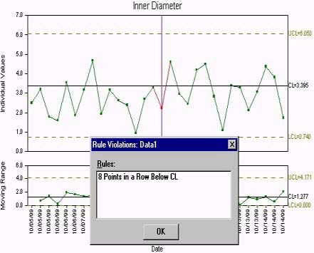
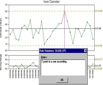
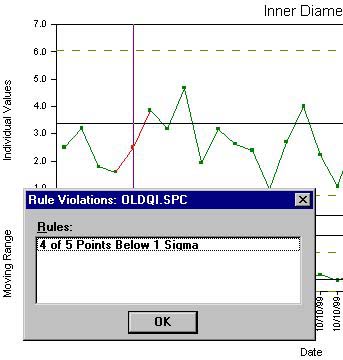
There are a number of statistical rule violations that indicate a process is out of control. One rule violation is when points falls beyond the upper or lower control limits.
Other non-random patterns that indicate the presence of assignable cause variation include: 8 points in a row falling above or below the center line, 7 of 7 points in a row ascending or descending, and 4 of 5 points in a row above or below 1 standard deviation (See Figures 13, 14, and 15 below). Different quality professionals and organizations such as AIAG, Western Electric, and Juran2, have their own set of rule violations to apply to data.
When a non-random pattern is identified, root cause should be investigated and an analysis should be done. Once the root cause of the problem is identified, corrective action should be taken to prevent the recurrence of the problem (or to repeat the behavior if the root cause produces beneficial results, i.e., significantly reducing variation). When a root cause and corrective action have been identified and initiated, the data point should be denoted accordingly. This information is valuable to other employees who are controlling the process and to quality engineers and analysts working on long-term improvements.
• Control Limits vs. Specification Limits
Sometimes users don't know how to proceed with an out-of-control process when the data falls within the specification limits. They believe that if the product meets customer requirements, then the process shouldn't be changed. However, as we discussed earlier, if the data incurs a rule violation, then we're 99.73% confident that there's some special cause that should be investigated. If the problem isn't addressed, it could worsen and eventually the product could become out-of-spec, or non-conforming. This example illustrates why SPC is viewed as preventative as opposed to reactive. As long as the process is capable of meeting specifications, then users have the advantage of being able to react to out-of-control processes before they become out-of-specification processes.
Capability and Performance Indices
Capability indices use only the "within-subgroup" variation (referred to as sigma, which disregards the "between-subgroup" variance), thus revealing the inherent capability of the process. Some capability indices are: CP, CpU, CpL, K, CpK, CR, and CpM. A CpK equal to one indicates that 1 out of 997 parts will fall out of spec. The higher the number, the more capable a process is of meeting the specifications.
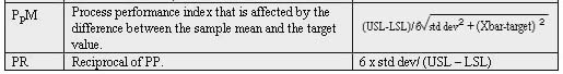
Performance indices use the process variability that includes both "within-subgroup" and "between-subgroup" variability (the process standard deviation), thus revealing the actual performance of the process. The performance indexes are: PP, PpU, PpL, PpK, PR, and PpM. (See Capability and Performance Indices" sidebar at the end of this article.)
The formula for Cp and Pp are (USL — LSL)/6 x standard deviation. The difference between the two is the calculation of standard deviation (Cp uses an estimation of process standard deviation referred to as sigma). These indices specify the ability of the process to meet tolerances. The formula for CpK and PpK is (USL — Xbar )/3 x standard deviation or (Xbar — LSL)/3 x standard deviation, whichever gives the smaller value. Again, the difference between the two indices is in the calculation of the standard deviation (CpK uses an estimation of process standard deviation referred to as sigma). These indices specify the location of the data.
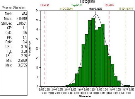
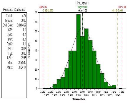
Let's return to our example of a part's diameter where the tolerance is 0.1 and the target specification is 3.0. If Cp or Pp is equal to or greater than 1.0 and the CpK or PpK is less than 1.0, this may indicate the process is capable of meeting the tolerance of 0.1, however, the process is not located at the target specification of 3.0; the process has a mean of 3.029. (See Figure 18.)
If these values are equal and are greater than one, this would indicate that the process is able to meet tolerance of 0.1and that the location of the process is close to the target value of 3.0. (See Figure 19.)
Implications of Indices
For example, in Figure 20 above, in Exhibit A, the process is centered at the process target of 3.0, yet it can only meet a tolerance of 0.2 (as opposed to the specification tolerance of 0.1). The shaded area represents the number of parts that will be manufactured out-of-spec. In Exhibit B, the same process capable of meeting a tolerance of 0.2 has been tweaked, changing the process average to 3.1 (the process is no longer at the process target of 3.0). As you can see, by shifting the process average away from the target, the process is now producing approximately 75% of the parts out-of-spec. Front-line workers cannot eliminate common cause variation; however, quality engineers and analysts should perform experimental designs to identify and minimize common cause variation.
Attribute Control Charts
The p Chart
An example of a p chart can be number the number of non-conforming circuit boards. For instance, there may be 24 non-conforming circuit boards in a lot of 500, hence the first data point on the p chart would be 24/500 or 0.048. Another point on a p chart may represent 8 non-conforming circuit boards in a lot of 200. The average proportion of defective circuit boards may be 0.04; so the center line would be 0.04.
The np Chart
As an example, the np chart can be used to monitor total defective coils. The lot sizes or subgroup size may be constant at 200. In the first lot, there may be 4 defective coils, while in the next lot there may be 11. These would be the first and second points respectively on the np chart. If the average number of defective coils is 6.2, this would be the center line for the np chart.
The u Chart
This type of chart can be used to monitor the total number of non-conformities on a box, and can include tears, bends, markings, etc. There may be three non-conformities found in the first subgroup of six boxes. The first point on the u chart would be 3/6 or 0.5. Another point may represent 12 non-conformities found from a lot of eight boxes. This point would be 12/8 or 1.5. If the average number of non-conformities per box (or per unit) is 1.4, then this would be the center line for the u chart.
The c Chart
Conclusion
For users interested in detecting small shifts in a process, other types of control charts are more sensitive to process shifts such as the Cumulative sum control chart or Exponential Weighted Moving Average charts. Regardless of the applications, control charts have the common function of using control limits to distinguish an in-control process from an out-of-control process.
Users of SPC reap many benefits. Data is acquired a more timely manner, hence an out-of-control process can be adjusted and corrected when the problem occurs as opposed to after non-conforming product has been manufactured. Therefore, costs associated with producing out-of-specification product such as sorting, reworking, and/or scrapping are drastically reduced with the implementation of SPC. Inspection times are significantly reduced, because 100% inspection is no longer required.
References
About the Author
Editor's Note: Readers who have questions or comments can send them to me at nkatz@metrologyworld.com. I will forward them to the author.
A number of important factors should be considered before implementing SPC. One of the most pertinent is determining which characteristics to monitor to control the process. These are referred to as quality characteristics. The quality engineer or analyst should perform an experimental design to determine which characteristics affect final product quality. SPC is ineffective if the characteristics monitored don't affect the final output quality.
Back to top
As mentioned earlier, there are two types of characteristics: variable and attribute. Variables are quantitative data that consists of numerical values; examples include the height of an individual when expressed in feet or inches, the diameter of a machined part, the amount of time a patient spent in the emergency room, the pressure reading on a vat of chemicals — essentially, any measured value used to assess quality. Attributes, on the other hand, are qualitative data identified simply by noting its presence. Attribute characteristics can be defined as counts of non-conformities (defects) or of non-conforming units (defectives). For example, an attribute characteristic might count the number of cold solder joints on a sample of circuit boards or the number of circuit boards that fail a quality (go/no go) test.
Back to top
Following is a rundown of the common variable control charts.
This chart — although it's really two separate charts, X-bar and range — is used with variable characteristics with a subgroup size greater than one. It consists of upper and lower control limits and a center line. On the X-bar chart, each point is the average of all the parts measured in the subgroup.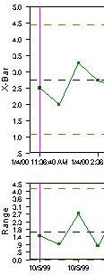
Even though the calculations are more tedious on the X-bar and Sigma chart, the widespread use of SPC software applications is making this chart a more popular choice. This chart doesn't use estimations to predict the behavior of the process. Instead of using the range of the subgroup to measure dispersion, it uses the formula for sample standard deviation to measure dispersion. As with the X-bar and Range chart, control limits are calculated using +/-3 standard deviations; however, the X-bar and Sigma chart uses the actual average sample standard deviation as opposed to the table look-up values.
An Individual and Moving Range chart, used when the subgroup size is equal to one, plots individual measurements on the top (Individuals) chart and the absolute value of the difference between the current and the previous measurements on the bottom (Moving Range) chart. For example, if we were monitoring malt extract in a brewery, the first value may be 79.43, while the second value may be 79.40. The moving range would be 79.43 — 79.40, or 0.03. This would be the first value on the moving range chart. The moving range is used in calculating the upper and lower control limits on both charts.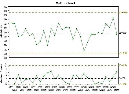
Back to top
As discussed earlier, the reasoning behind using three standard deviations in the calculations of the control limit is because we are 99.73% sure that if the data is normally distributed, the points will display a random pattern within the boundaries of the control limits. If the data falls outside the control limits, we are 99.73% sure that some notable change has occurred. The focus of the control chart is to distinguish a process that exhibits common cause variation versus a process that exhibits assignable or special cause variation.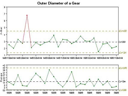
Back to top
Users of SPC must be able to distinguish control limits from specification limits. Specification limits are externally set limits — which can be determined by engineers or defined by customers — that define minimum, target, and maximum limits for operation. [Some specifications may only include a minimum, or lower specification limit (LSL) or may include only a maximum, or upper specification limit (USL)]. Tolerance is the difference between the USL and the LSL. For example, if a part's target diameter is 3 in. with a tolerance of 0.1 in., then the USL is 3.05 in. and the LSL 2.95 in.
Many users plot data in a histogram to determine where the data falls in respect to the specification limits. Sometimes referred to as a frequency or probability chart, a histogram is a graphical presentation of the distribution of values summarized into bars or intervals. Specification limits are used to compute process performance indices and capability indices. In many SPC reports, these indices accompany the histogram. Capability and Performance indices are statistics that indicate how well a process is capable of meeting the specification limits (tolerance). Let's take a closer look at them.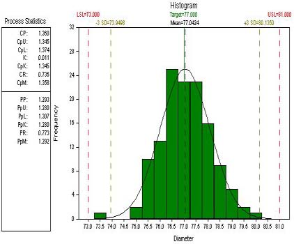
Capability and Performance studies are done on a process that's in statistical control. Because processes that aren't in statistical control aren't stable or predictable, these indices wouldn't be valid. When a process is in statistical control, but isn't capable of meeting specifications, employees controlling the process may try to tweak the process to bring it into specification. However, because the process isn't incurring assignable cause, efforts to bring the process into specification would do more harm than good, and may even cause the process to output even more out-of-spec product. If a process is located at the target specification, but is not able to meet the tolerance (this would occur if all process indices are equal but less than 1.0), then trying to tweak the process may actually shift the process from the target value, thus causing the process to produce an increased amount of non-conforming material.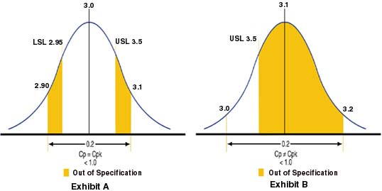
Back to top
Previously, we discussed variable characteristics and the data that can be plotted on control charts. The other type of characteristic is an attribute characteristic. There are four types of attribute control charts — the p chart, the np chart, the u chart, and the c chart. Like the variable control charts, the attribute control charts are made up of a center line and an Upper and Lower Control Limit. The control limits are based on ± 3 standard deviations from the center line. However, because there never can be negative non-conforming parts or non-conformities, sometimes the distances from the UCL to the mean and the distance from the LCL to the mean may not be equal. In addition, unlike the variable control charts (due to the nature of the data), attribute charts aren't broken down into two charts (i.e. X-bar chart and Range chart).
There are two types of attribute data. The first type classifies each unit into two categories such as conforming/non-conforming, pass/fail, go/no-go, or present/absent. A p or np chart is used to monitor these types of attributes. The p chart or the proportion non-conforming chart, also called fraction defective control chart, displays the subgroup proportion of non-conforming units for an attribute characteristic. The data you collect is the number of non-conforming parts (parts that fail to pass) in a subgroup. The proportion can be expressed either as percentage or as fraction. The center line of the p chart is the average proportion non-conforming.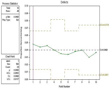
The np chart or the Number Non-conforming chart, also referred to as the Number of Defectives chart, displays the number of non-conforming parts in a subgroup for an attribute characteristic. This is particularly useful if the subgroup size is constant and the fraction non-conforming is small. This type of chart provides essentially the same information as the p chart. The basic difference between the p chart and np chart is a scaling of the vertical axis by a constant (the subgroup size). The center line of the np chart is the average number of non-conforming parts.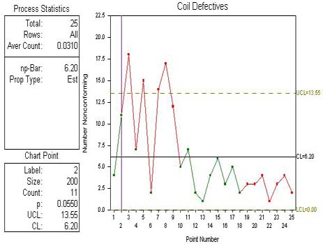
The second type of attribute data involves counting the number of occurrences of a condition in one or more inspection units, such as the number of non-conformities, occurrences, or events where the number can exceed the number of units inspected. A u or c chart is used to monitor these types of attributes. With c charts and u charts, the total of non-conforming and conforming units can't be counted. It's impractical to count the absence of a non-conformity. The u chart, or the Number of Non-conformities per Unit chart, also known as a Number of Defects per Unit chart, displays the number of defects per unit in a subgroup for an attribute characteristic. The data you collect usually contains the total number of defects of different types for each subgroup. The subgroups can contain different numbers of units. The center line for the u chart is the average number of non-conformities per unit.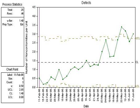
The c chart, also called the Count of Non-conformities chart or the Number of Defects chart, displays the total number of defects in a subgroup for an attribute characteristic. A c chart is used when the sample size or inspection unit does not vary.
Back to top
Statistical process control is a simple tool that helps users understand their process. It provides valuable information that is easily interpreted by all types of people in an organization, from front line operators to department managers. There are many applications for SPC. In the past, it was believed that SPC could only benefit manufacturing facilities with long production runs (i.e. producing the same type of product for a long period of time). However, in today's manufacturing environment many operations are short run. SPC is not limited to facilities with long production runs; there are short run control charts such as the Zed chart and the Difference chart that are powerful tools for monitoring short run processes as well.
Back to top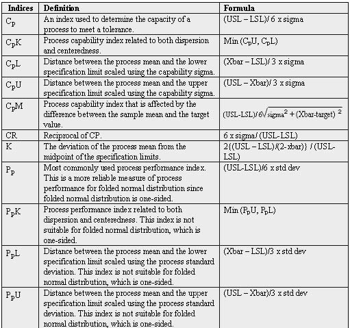
1. Quality with Confidence in Manufacturing, Jeffrey T. Luftig, Ph.D.
2. Juran's Quality Control Handbook, J.M. Juran
Jodi Kay has been working as a quality engineer for SPSS Inc. since joining the company in 1996. She currently works on special projects for the Quality in Manufacturing group. Kay received her bachelor's degree in industrial and systems engineering from Ohio University in 1990, and is finishing up her MBA at Depaul University. Since graduating from Ohio University, she has been employed at Com-Corp Industries, Carbide International, and Ferro Corp. as a quality engineer.